Houseplant Healer
Project Overview

Project Duration
April - May 2024
My Role
Sole UX Designer, UX Researcher, UX Writer & Tester
The Problem
Identifying problems with houseplants is often very difficult, especially for novice gardeners. Effective gardening requires a reliable source of information, and also some note-taking.
The Goal
-
Allowing users to identify Issues with their plants.
-
Journal user's plants to track of their progress.
-
Provide resources for learning more about gardening.
Research Phase
Preliminary Research
While investigating the target demographic for my project topic, I found that gardening is one of the most popular hobbies in the world, this means my designs would have to work for large and diverse groups of people with different ages and abilities.
Here are the personas I created to empathize with them all:
Personas

Sergio
Seasoned Gardener -
"I don't need a tool that tells me what I already know, I need it to diagnose and resolve issues that I can't by myself."

Freya
Large Scale Gardener -
"The more plants you have, the more they are worth to you, and the harder it gets to manage them"

Rohini
Beginner Gardener -
"I find it difficult to even tell different plants apart. How do I take care of them?"

John
Ecologist -
"Bio Diversity is in decline worldwide, and it's our fault, we have to take responsibility and provide spaces for plants and animals in our backyards."
User Pain Points
01
Knowledge Gaps
Plants can have very specific care needs depending on species and may vary with seasonal changes, this makes it hard to care for them, especially for novice gardeners.
03
Scheduling & Noting
As the number of plants under a gardener's care increases, it becomes harder to simply remember when a plant was last watered or fertilized.
02
Diagnosing Problems
Even identifying a plant species can be contentious, a sick plant can be even more difficult to diagnose. Professionals to deal with such issues are not readily available for a reasonable price.
04
Lack of Resources
Sources of information regarding plant-care can be sparse, conflicting, and riddled with paid promotions.
User Journey Maps
Sergio

Rohini

Freya

John

Early Design Phase
Site Map

Desktop Wireframes
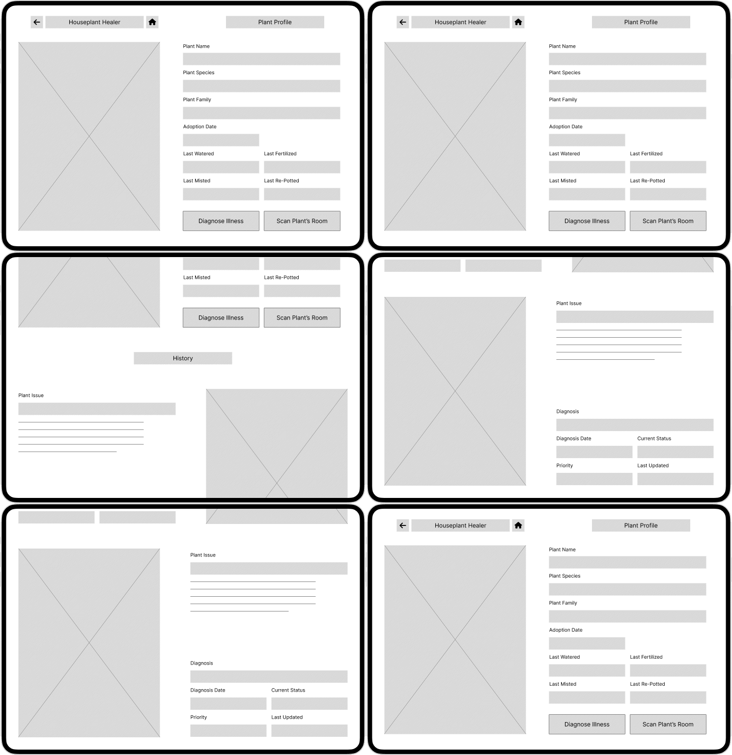
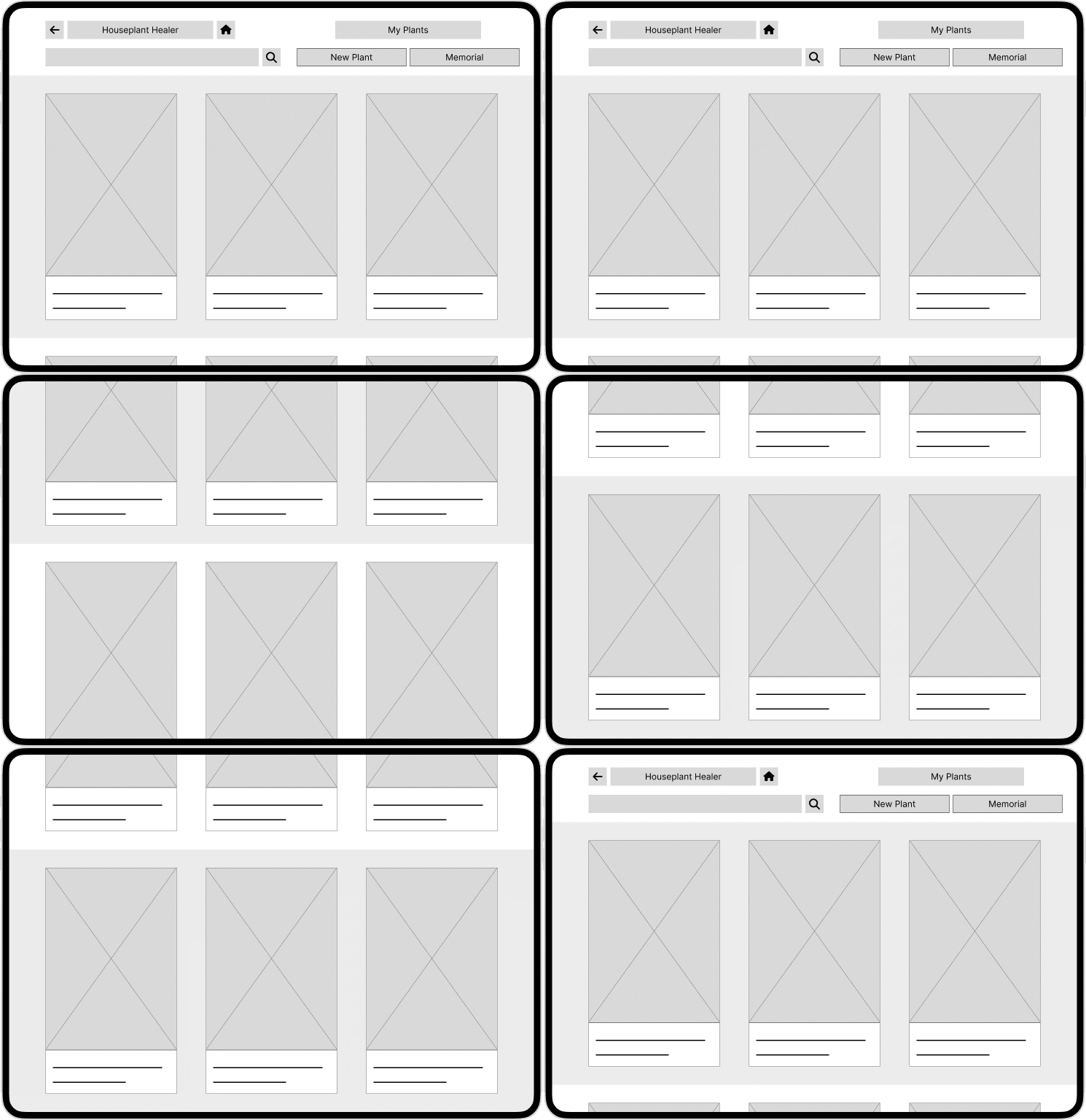
Plant Profile Page
My Plants Page
Tablet & Mobile Wireframes
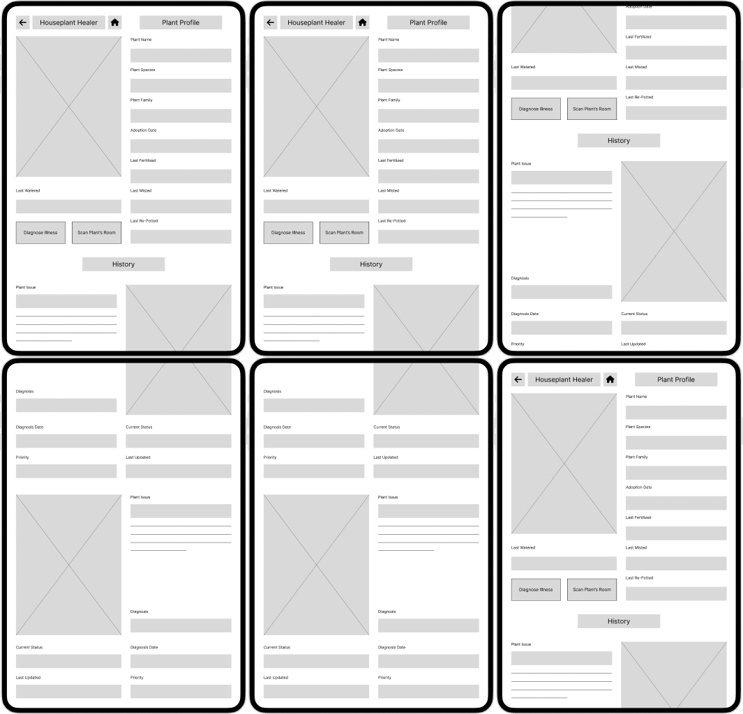
Tablet Plant Profile

Tablet My Plants
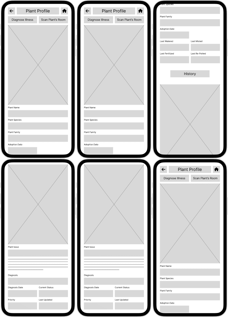
Mobile Plant Profile
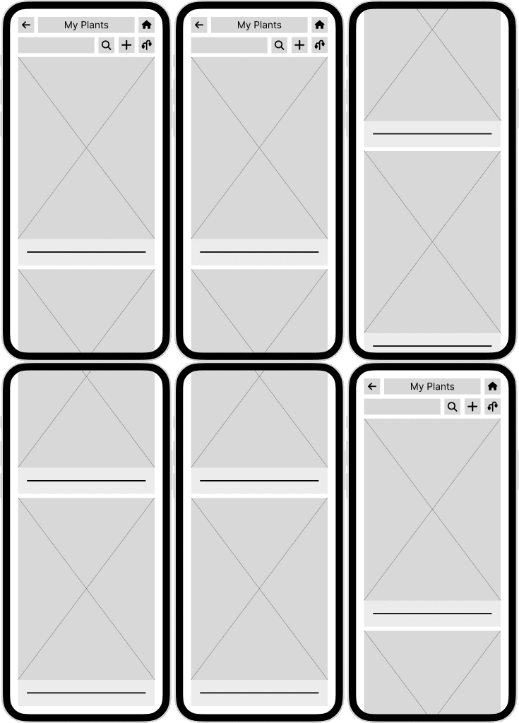
Mobile My Plants
Lo-Fi Prototypes
User Study 1
Usability Study 1 Details

Study 1 Findings
01
Back Button
Most users preferred to use their browser's controls for navigating back to a previous page, hence the interface could be made cleaner with one less button.
02
Memorial Page
The memorial page was confusing users. They were not sure why deceased plants needed a page with a separate control on the header itself, it was cluttering up the UI.
Late Design Phase
Desktop Mockups
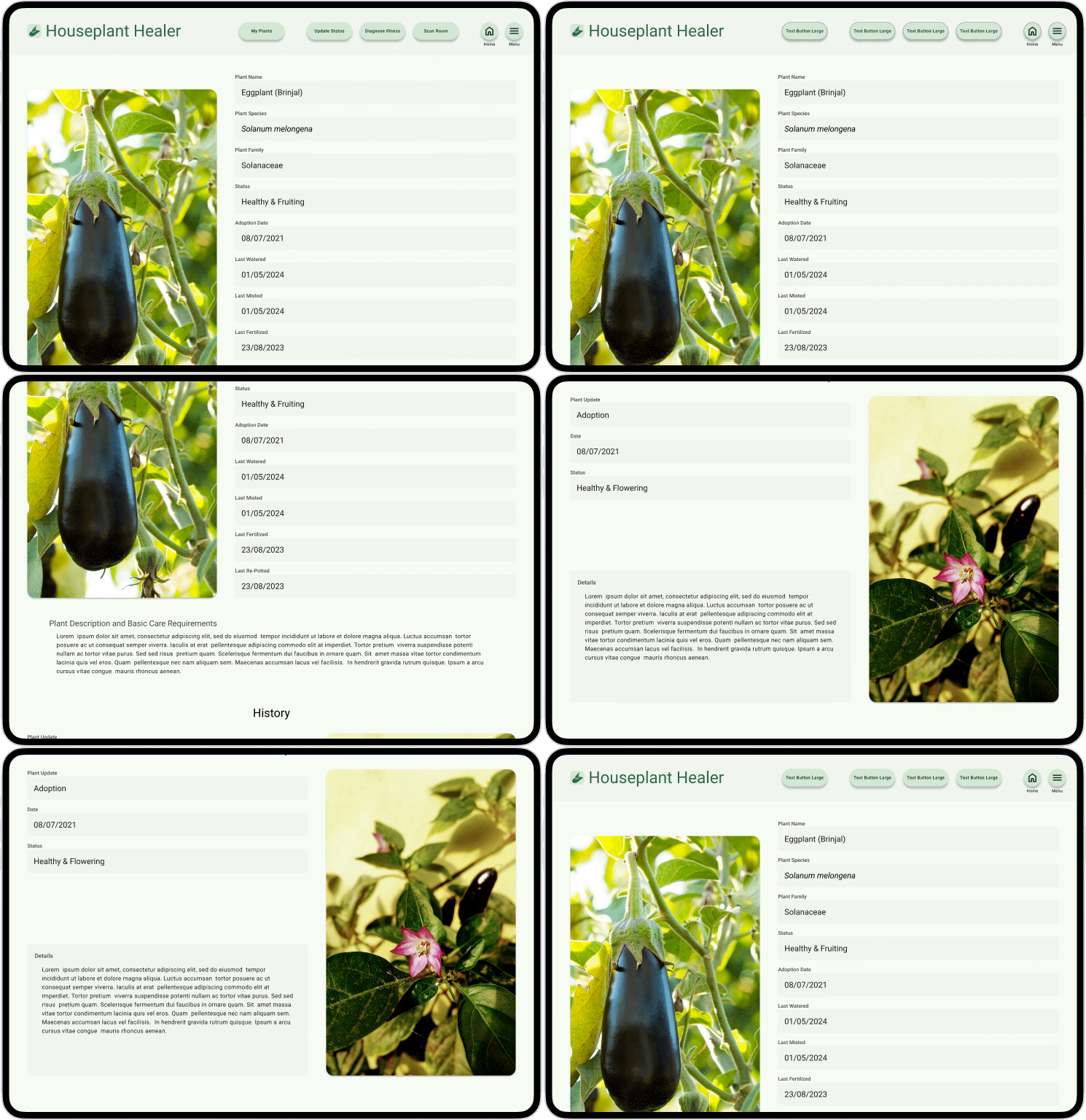
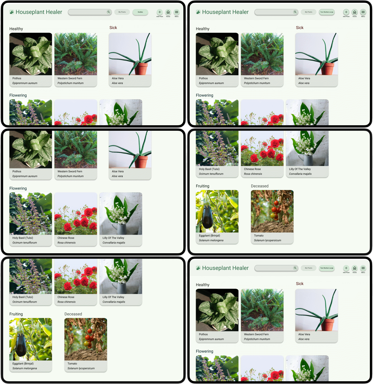
Plant Profile Page
My Plants Page
Tablet & Mobile Mockups
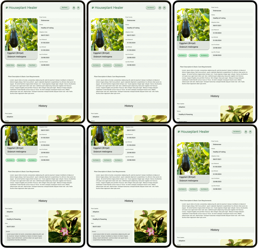
Tablet Plant Profile
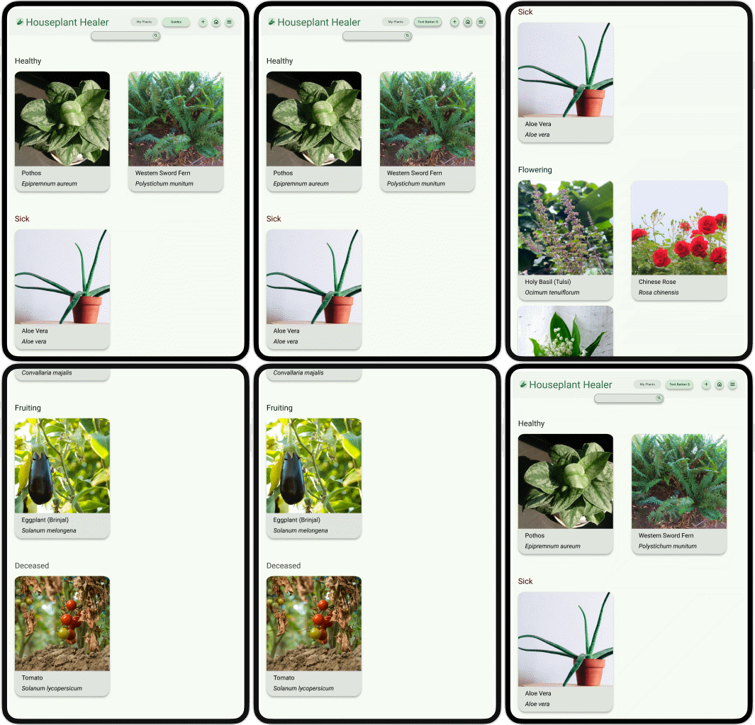
Tablet My Plants
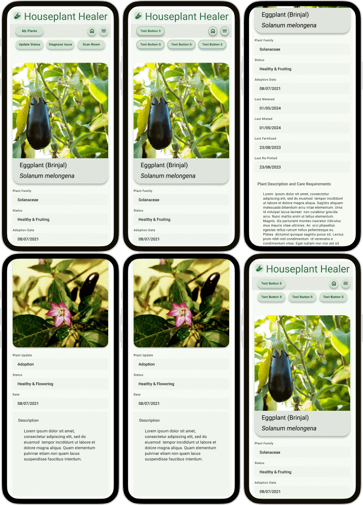
Mobile Plant Profile
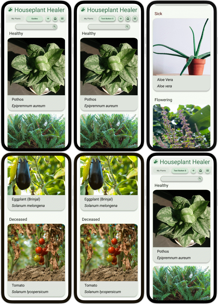
Mobile My Plants
User Study 2
Usability Study 2 Details

Study 2 Findings
01
Plant Information Fields
The containers for plant information in their profile had drop-shadows, which users attempted to interact with because they mistook them for buttons, so I removed the shadows which also lead to a cleaner look.
02
Navigation Hitch
Users were struggling to find their way back to the my plants and guides pages from individual plant profile or guide article pages, so I added a button to make it really easy.
Hi-Fi Prototypes
Finale
Accessibility Considerations
01
Colors
I used Google’s Material Design tools to generate a color palate to ensure that all WCAG visual accessibility requirements were met while still getting awesome visuals.I used Google's guidelines about using the generated themes as well.
02
Typography
I used Material Design’s fonts, because I found that they were easy to adapt for all the three platforms I was designing for, and provided maximum legibility, while looking elegant. I used the different text hierarchies for clarity and separation.
Conclusion
1
Imapct
I was surprised to see the reception to my design among my peers. This was only the second project I did in UI/UX, but with the help of some tools and guidance, I was able to achieve a visually appealing, yet functional, and accessible design.
2
What I Learned
-
This was only my second full design, but now I feel several times better equipped to tackle a project with this one under my belt
-
I was able to use a design system that I had not built and get the desired results.
-
Also, I learned that drawing on paper is absolutely not the same as digital. Both have their place in UI/UX design.